
It’s
that time of the year – a transition from the past year to the new!
A time to
look back but also to look forward through the glass of a windowpane, perhaps?
here’s wishing every person who steps in
(leaving ‘thoughtprints’ below) or
peeps in (a quick glance through the window)
a very happy, creative, peaceful, and TATalizing 2019 !
I thank you for being a part of my blogging journey –
happy memories of inspiring interaction, personal growth, and creative connection.
I hope you stay a bit to answer a few questions....
Q.1.
What is the best thing you like about this blog?
Q.2.
What is it you most dislike about this blog?
Windowpane
Square
is this new motif I’ve been working on sporadically. It started out as a kind
of pointless exercise and that’s what I called it – a pointless square ;-P But
you see the paradox there?!
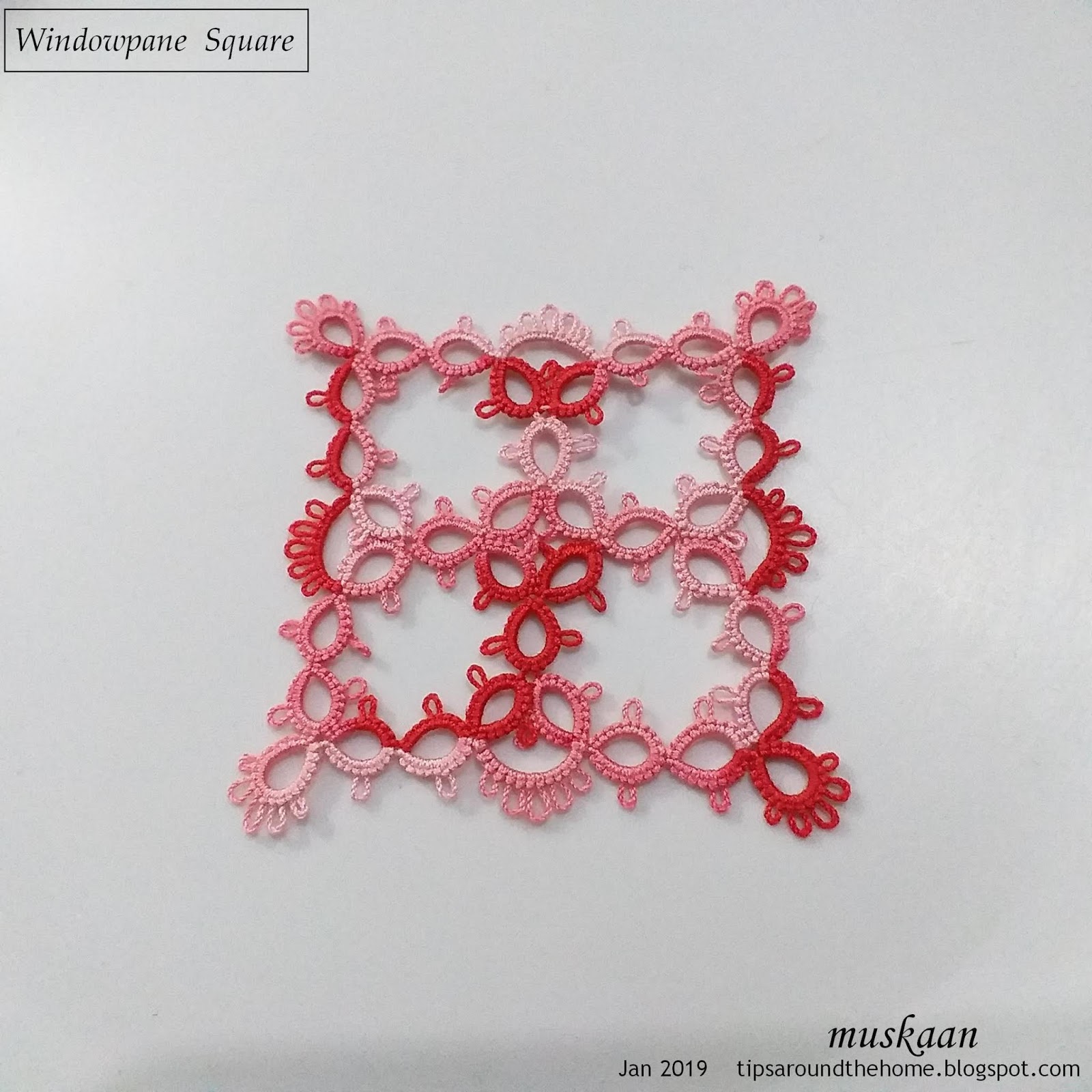
As I went along, though, loads of
ideas cropped up. The large negative space can be filled in completely or
partially; cut out a square from cardstock and glue this as a frame …. Hey it’s
a window frame with a windowpane !!! The accessories could be glued (mixed media)
or tatted over the 'pane' or behind it depending on whether the viewer is in front of the window or
behind it?

I was hoping to make at least one
such new year’s card out of it, but my whole world slows down during winters.

In order for it to look more like a window, I tried using 2 colours.
Each of these has a slight tweak. The bottom 2 don't have picots in the center.
All squares are worked in size 40 Anchor and measure about 5cms.
Q.3.
Does the square look better in single colour, variegated/tinted, or 2 colours?

All
5 laid together. One can join motifs to make a large fabric.
I think it might
lend itself to a Magic Square, with the use of SCMRs, but am not certain yet. Robin?
Q.4.
Of these 5 squares, which do you like best?
Your
answers will help me improve both blog and motif presentations.

And
here’s another arrangement I am eager to tat – a bookmark or wide lace, with
some overlap between corners. My first thought had been to interlink them. What do you think?
So many questions,
ReplyDelete1 I like your window plane square lot of possibles, I like both the plain colour and the variegated colours but I do love variegated thread so I can’t answer that one very well, I do like the two colour variations
You could interlink them or just tat them to look as if they are over lap but really the corners are tatted in one go. I think that makes sense.
I love your blog for inspiration and ideas.
What do I dislike about your blog, please just don’t write so much in one go.
Margaret,I truly appreciate you taking the time to answer each question !!!
DeleteAnd yes, guilty as charged ;-P In my attempt to make each post comprehensive and complete, it becomes lengthy. I've been consciously trying to reduce, but will work on it more diligently. Thank you :-)
The two colors really make it POP. Also love the layering look. Awesome job!!
ReplyDeleteThen there's going to be a bookmark pattern soon, Marie ;-D Thank you.
DeleteLovely squares, I do like the two colored versions in #4 and #5. As for a magic square, you’d have to figure out how to make each square in one round first. I can’t visualize it but I’m also not as handy as you are with different techniques!
ReplyDeleteHmm, it is a 2-round square worked continuously, but I see your point (which is why SCMR came to mind). It was a last minute idea while blogging ;-P I'll have to spend some time with your magic square tuts before coming to any conclusion. Thanks, Robin :-)
DeleteHello
ReplyDeleteI wrote a long answer to all your questions, pressed preview to make sure I hadn't left any typos, and it disappeared my answer, so here is a briefer version. I just love your blog. You give so much quality time and effort to it. Your illustrations are excellent, your patterns are beautiful and intriguing and make even complicated ideas clear and your explorations of the possibilities of tatting are terrific. I love the quality content you provide. The more the merrier! I have one small quibble to answer your second question. I would prefer to read the text of your blog left justified, rather than centered.
I like #5 best I think.
I can't imagine them interlinked as the corners seem too complex to under/overlap cleanly.
All the best for 2019. I'm looking forward to your posts.
Best
Ruby
How frustrating, Ruby! It's happened to me, too, but now I miss out on your in-depth response. Thanks for persevering, though - really appreciate it!! Also the praise you heap ;-P
DeleteAs for text being left justified - consider it done ;-D
You may be right about the interlinking not being clean - it may also be a bit floppy. Though not difficult since the interlocking will occur only during the 2nd round. I'm undecided as yet.
Wish you a very great year ahead, too :-))
I love your blog, because you explain in depth what you are doing. I find that fascinating. The thing I like least has nothing to do with you, but with me... I don't always have the time to read slowly and take everything in! For this design, I think I prefer the solid color. Design 5 is my favorite. I like seeing it set on point. It looks like you're off to a good start for 2019!
ReplyDeleteWe know that one can learn from mistakes, avoid same mistakes, or branch out successfully at any step to create one's own path. This is why I tend to include my process. I'm glad you enjoy it, Diane :-))
DeleteBut I really Must be less verbose, deep sigh!
Thanks for your feedback :-)
I love the inspiration I get from reading your blog, but also the tips and lessons!!! :)
ReplyDeleteI love your use of color too!!! :)
As for your squares, I think I like the solid color or the 2 color better than the variegated for your windows(and that is funny because if you can't tell, I LOVE variegated threads, but I have learned they are not always the best for certain projects). ;)
Can't wait to see what you tat this year!!! :)
I knew you'd skip the 2nd question, Sue - you are always complimentary of everyone and everything :-)))) Thank you very much for feedback. I agree about the variegated !
DeleteI've barely tatted anything this year - my brain is semi-frozen and is not sending tatting commands to my hands ;-P Hopefully I'll thaw out soon enough ....
I love the 'square' snowflake tatted in one colour. I enjoy reading your blogs but prefer the text left justified. Thank you for all your inspirational work.
ReplyDeleteThe text justification is easily remedied; it's the brevity that trounces me ;-P Thank you so much, Anne!!!
DeleteI love seeing the new ways one can use tatting.
ReplyDeleteBut I am not versed in split ring. Tried many times and fail to grasp the concept. Love the varigated square best.
#5 if one uses 2 colors for this square.
Thanks for sharing your work.
It's fun to play around with new 'uses' and arrangements, isn't it Sam!
DeleteWhen I first learnt the split ring in 2014, I simply focused on the fact that the core thread should be held TAUT when working the 2nd half. The tautness will prevent the stitch from flipping. It does not matter how you hold the thread on your hand when working the ring; what matters is whether the core thread is taut for unflipped stitches (but 'loosened' for flipped stitches).
I hope this helps - SR is a useful technique to master.
Thank you for your response and answers :-)
I love the different topics you cover and it is fun to visit to see what you are covering. I too feel like my time is short and wished that you left up your posts up longer so I could really look at them longer before you went on to another subject. Cause usually I am in the middle of something else. I tend to forget what I wanted to try, or look at more, and then you come up with something else. I get like this when I go into a fun store I just cant remember what I was looking for :)
ReplyDeleteI think we are all mostly similar in that aspect, Carollyn - busy and distracted and too many wanna-dos ;-P I'm in the same forgetfulness boat, lol. And actually have more work done than blogged - so have a HUGE backlog to put up. How do I stop ;-P
DeleteBut seriously, if there is anything in particular you wish to look for, just email or leave a comment under the latest post & I'll try to hunt it down.
Q1: definitely a tidy blog, I know where to look at to find that tip I needed, or even my own blog posts, lol!
ReplyDeleteQ3: single colour
Q4: number 4, and ok you're right, it's not the one in single colour. Your tatting is perfect!
Thank you very much for this beautiful and useful blog!
Thanks for these answers, Nin, but I won't let you off the hook so easily! Where's the answer to Q2 ?! ;-P I'm a big girl ans won't be offended :-D Thanks for the appreciation, though :-)
DeleteYour attention to detail is your best and worst feature, for me. I like your attention to detail, but sometimes my eyes glaze over! I think the variegated thread detracts a bit from the square shape. Love the ideas here. The overlapping idea is especially interesting.
ReplyDeleteAh, Jane, glaze should be left for coating food, etc. not eyes ;-P But I totally agree with you - faced it myself with a couple of my own past posts/patterns (cringing)! Will be more vigilant henceforth, but feel free to point out my missteps.
DeleteThanks for your feedback :-)) Waiting for new colours to arrive before I start work on this motif & bookmark.
Best thing about blog: Great ideas and techniques
ReplyDeleteLeast liked: I don't have time to practice everything you post about!
Love the solid pink window frame
Two colors give depth and dimension to the frame
I especially like when they are overlapped on the corners!
Thank you for the gift of your blog!
~Heidi
This is so sweet, Heidi!!! Thank you very much for your feedback :-))
Delete