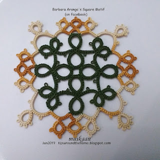
Barbara
Arango spotted a bag where the fabric had tatting prints. She successfully
converted the print into an actual tatting pattern – reverse-reverse
engineering?!
I
remember Frivolè and a couple of other bloggers have also done similar
conversions.
And
she generously shared a sketch of square motif pattern on facebook.
I
chose colours and size to match Ninetta’s Quad 13 square which I made back in 2015. Both have a
similar kind of composition in terms of tatting techniques - lots of thrown or floating rings.
I think the green kind of overpowers the tinted brown in the new motif. May be I should've made the inward facing large rings in the tinted shade to balance the colours?
TIP : It can be worked in
one pass if both shuttles have the same thread. I would start with the right
twin ring working clockwise and exit from the left twin ring worked as a split
ring. Then continue around. Just one set of tails to hide at the end.
It is interesting how they both measure the same despite their open versus dense look.
Both are 3” along the sides and 3¾” diagonally in Anchor 20.
Will take a pic of them together when I find Nin’s square. I liked it too much to give it away!
I
enjoyed tatting this. Barbara’s are in all-white in finer threads and they look
very pretty!
Many
thanks to Barbara (and Ninetta) for
sharing their patterns :-)


I do like the pattern. Yes, perhaps the colours should’ve been more equal, though in the Ninetta square they work fine together.
ReplyDeleteI agree, Jane 💖💖 Should've tried to think through it and visualize it deeper 😄
DeleteFabulous squares!! :)
ReplyDeleteKudos to the designers, Sue :-)))
DeleteIt's beautiful and sometimes I think the color difference brings out elements you wouldn't have noticed before 🌹
ReplyDeleteThat is exactly my intention when working with colours, Carollyn! :-D
Delete👍
DeleteBeautiful!
ReplyDeleteThank you, Maria :-)))
DeleteBeautiful! I am often surprised at the way color choices work out. Sometimes pleasantly, sometimes not, so I always look at my pieces as opportunities to learn more about color theory without taking a course in it. I agree, the green does seem to overpower the brown, but I still like the way it looks!
ReplyDeleteI agree, Diane!! Now that I finally have a large range of colours to choose from, I am getting the combo right most of the time. It had started out as a colour exercise a few years back in Susan Fuller's Design class. When I know the techniques, I try to learn colour :-D
Delete