I’m pretty much engrossed in some other stuff but here’s a
quick peek into what I did last week.
Clover Wreath Mats
(DIP - design in progress)
This is the one with 3 strands of embroidery thread I shared here. I’ve stopped here and will decide what to do with it later....
Instead I started one in Anchor size 20 (thicker than
Lizbeth 20) in 2 colours. I wanted to try a swirl join in the center of each
medallion but kept forgetting. So finally I remembered while tatting the 3rd
motif and used it for the center.
What do you think? The swirl seems to round up the motif, right?
I was still too focused on the original 2-colour version
that demarcated the inner clover ‘flower’ surrounded by arching ‘stems with
leaves’. But when tessellated, these leaves formed another small 6-petal floret which
gets lost in 2 colours because the eye is drawn to the yellow flower.
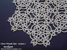
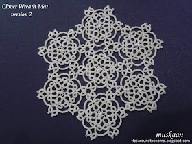
Time to try it in single colour - this time in Anchor size 40. Also, picots on the
chains seemed to add some clutter, so out with them! I didn’t want to change
the chain stitches, though – they arch beautifully to form a larger petal
outline, don’t they?!
This one has swirl joins in all motifs.
I love how little changes go a long way in altering one’s
focus.
Colour, texture (swirl join), clean chains (picot-free) are the 3 tweaks made in this 2nd version.
Which one of these do you prefer and why ?
Hexagon is my favourite shape, and especially so for
tessellation – so many possibilities ! Reminds me of quilting. One can go 'straight' or go round, with numerous in-betweens.
3 hexagons in each version for a quick comparison -
Each medallion/motif tats up pretty quickly – one a day without
stretching oneself. But I wanted to experiment with an edging. I’ve sketched a
few simple ones trying to outline the chain arches and even started tatting one
idea. But this project is stalled for the present. Any ideas are welcome.
And before signing off, please do check the lovely earrings Carollyn made using the poinsettia version !!! I was thrilled to see them and the model too :-)
happy tatting always J
Related Posts -


I like them all, and had to look closely to spot the differences. If I had to pick, I kind of like the picots on the chains, and the two colors. I’m drawn more towards the blues, maybe because there’s less contrast between the colors?
ReplyDeleteIt’s always so difficult to settle on just one version of a pattern to write out. And of course the more variations, the longer it takes to get everything diagrammed and written.
I like them both but the brown and yellow is my favourite. Why? It draws the eye in to explore the different combinations and spaces. The eye tends to skate over the wholey white one. Does that make sense?
ReplyDeleteI think I have to choose the blue for obvious reasons! ;-) It is interesting to see the possibilities. I'm often drawn to tatting done in more than one color, because I can see parts of the design better. I agree with Jane about the eye skating over the solid color.
ReplyDeleteAbsolutely awesome!!!! :)
ReplyDeleteI love all the different designs which can be seen through each different example!!! :)
Your mat is stunning!!!!!!!!!! :)
I love the red/ yellow one because so much catches my eye, especially the fleurettes created byjoining the motifs. The blé is lovely too. The swirl join is pretty but the other is also. The chains with picots create more visual interest imho. All in all, really quite beautiful.
ReplyDeleteI love this one color - white is beautiful
ReplyDeleteI like them all. Would be interested in seeing one with the flower dark and the surrounds lighter.
ReplyDeleteI can't thank you enough - such insightful and enlightening comments ! But it just makes my decision that much harder to arrive at ;-P Just kidding - I'll leave it to individual tatters :-D
ReplyDeleteSince I like to design with 2 colours to demarcate the shuttle used, it becomes difficult to distance oneself from the original.
Audrey, you've just increased my workload further ;-P I'm now curious to see how the switch works out !
After reading all your observations I laid the 3 out for my DH's opinion as a layman. He, too, felt that the yellows popped out better. But the single ecru one looked more like 'lace' since it was in finer thread. Yeah, you guessed right, no clear answers ;-P
Thanks once again - your reasons are very helpful in designing !
Have a great weekend and hugs to all!
What an impressive production! Wonderful!
ReplyDeleteI like the swirl join very much; it makes a neat and lovely center. I also prefer the chains with picots; but of course I'm so fond of picots I often add some to patterns that don't feature them. I feel they add some cheerfulnees to a motif. As for colours, I'll go with two. I like your two combinations, but I prefer the red/yellow that provides a sharp contrast, so neither the centers nor the edgings are "swallowed" by the other.
Oh and I agree, the poinsettia earrings are fabulous :)
Thanks, Sylvie :-))) Very good reasoning and seems largely in conformation with the majority. Now I know which pics to put in the pdf 'first' ;-D
DeleteDid you know Agnieszka has started a kind of 'picot challenge' that you might be interested in. Check it out here - http://frywolaga.blogspot.in/2017/10/zabawa-pikotek.html She's created a doily without picots and those interested need to add decorative picots wherever they wish !
Oh what a fun challenge! I didn't know about it, thank you so much for the link :)
DeleteQuite lot of efforts for this post Muskaan! I admire all. Especially the white one is so elegant with centers joined with swirl join.
ReplyDeleteThanks, Usha :-)) The idea for swirl join probably came because of your comment on joining picots across (woven picots)?!
DeleteYes of course. I love design with center picots together as it covers the blank center space and look wholesome.
ReplyDelete